Dec 13, 2010

News apps a growing trend among college students


More are getting news from phones and Internet rather than newspapers or TV
Before Bowling Green State University sophomore Max Filby heads to class every morning, he checks the day’s news.

But he doesn’t have to go to a newsstand, or in his case, the front desk of Founders Residence Hall. Filby simply grabs his iPhone and scrolls through the New York Times on an application.

“Every day when I get up I check my iPhone,” Filby said. “I grab it and look up the New York Times app and see what the top headlines are, see if there’s anything interesting to read or tweet about.”

Though the New York Times is usually delivered to the residence halls on campus, Filby said that’s not always the case.

“The New York Times costs a lot of money, and the app is pretty much free,” he said. “I live in Founders and sometimes they don’t always deliver the papers over there.”

A growing trend
Filby is part of a mass trend of people following news on the go.

About 33 percent of people read news stories online, according to people-press.org. When newspapers first began publishing stories on the Internet, they attracted anywhere from 2 to 4 percent of the population.

So, while printed newspaper readership is falling, online news readership is climbing.

But Filby doesn’t think that this will cause the death of newspapers.

“News is always going to be around,” he said. “No matter how people read it, it has to come from somewhere.”

It's the only way some get news
Meg Kettinger, a junior at BGSU, said she hardly ever checked the daily news before she got her droid phone.

“Whenever I go to that screen on my phone, it shows me all things, from news to celebrity, stuff like that,” she said. “I think [apps] are popular because…you don’t have to pick up a newspaper and read the stories, you don’t have to sit in front of your TV and you don’t have to sit in front of your computer because now they’re on your phone. And who’s not on their phone all the time, in this day and age?”

Before Kettinger got the news on her phone, she said she did not really keep up with current events. 

When she would watch TV and the news came on, she would not watch the news. And when she surfed the Internet, she was not looking for news stories.

“When I got my phone it was more helpful to keep up with things because I had an app rather than literally having to change the channel,” Kettinger said.

Future of newspapers not in trouble
Sarah Culmaker, a BGSU alumnus, said she would call herself a “news junkie,” and spends a lot of her time looking up stories on her iPhone.

“It’s mostly celebrity, gossipy stuff like that,” she said. “I still pick up the newspaper, but not as much as I used to. For those national and international stories, I think it’s hard to get those in the local paper.”

Culmaker also said she didn’t think the presence of online news would cause the death of newspapers.

“It’s just a different way to read the same news,” she said.

Dec 5, 2010

Space Jam

This blog post is not about Michael Jordan teaming up with the Looney Toons to beat some weird alien creatures in a basketball game.

This blog post is about the jam designers get into when there's too much space and not enough content.

What to do?

This affliction often befalls newspapers, especially daily newspapers, because slow news days do happen. Sure, everybody prays for a drug bust or a political scandal or for someone prominent to die (don't judge, you know you do it too), but sometimes the most newsworthy event going on all day is a feminist bake sale outside your own newsroom. That's no good. But don't worry; it happens to everyone at some point (if someone tries to tell you they never have to run mediocre photos or stories to fill space, he is a liar).

Here are some ways I've seen extra space used well and not-so-well in the past.

Good use of empty space:
BIG HEADLINES - You don't want to blow up the headline about the abundance of cats at the local animal shelter, but a nice big one for a story about the weather works nicely.
PHOTO SPREAD - This doesn't work so well on those days when literally nothing is happening on campus, but for the most part, a photog can whip something up. If not, it's a good idea to keep something in your back pocket, like if swing dance practice happens every Tuesday. Save events like those for a rainy day.
ANOTHER STORY - Get a reporter to get off his ass and go do his job.
LIL' SOMETHIN' EXTRA - Deckheads, pull quotes, headshots, etc.
TEASERS - Tease something on the web. Works every time.

Bad use of empty space:
BIG HEADLINES - This is both a blessing and a curse. Bigger doesn't always mean better. Be careful.
MAKING BAD PHOTOS HUGE - Just don't.
HOUSE ADS - These work well when they're tiny and nothing else can fit, but don't make them giant. Please.
LEAVE THE WHITE SPACE NOT FILLED IN - What?

So remember, white =/= right.

Dec 4, 2010

How to

No two designers tackle a page the same way. Some start with the centerpiece, others save that for last; some place stories right away and others wait until the page is complete.

Basically, there is no right or wrong way to to be a page designer.

However, here is a method which works.

Aspiring designer Rachael Betz shares her method of getting down with news design. Enjoy.


Dec 3, 2010

And now for something completely different

Tis the season for chilly weather, hot chocolate, holiday music and all things festive.

But don't forget your newspapers when getting into the holiday spirit. They may not keep you warm at night, but, with a little imagination, they can be more than words.

First, why not ditch that boring white paper for some snazzy newspaper when making snowflakes? It looks more interesting and will provide those around you with festive reading material.


This alternative will always be a favorite under my tree. Newspaper gift wrap is cheap, readily available and more eco friendly than the shiny stuff from Wal-Mart. Newspaper people love recycling.


This next one may be a bit time consuming, but if Martha Stewart can do it, you can too. This glittery newspaper Christmas tree is the perfect decoration for home and newsroom alike.


Last, but not least, don't keep your newspaper love inside. Proudly display it on your front door for all to see. 

This newspaper wreath will, again, cost you less than the prickly, evergreen assortment. And all of your neighbors with their ostentatious plastic reindeer will be jealous of the beauty this simple, elegant wreath provides.

Dec 1, 2010

Read the story

Designers need to read the story for which they're trying to think of a clever design. It would be so much easier than asking reporters what the story is about. Chances are the writer will just give a four-second synopsis, but if the designer reads the story, he or she will be able to see exactly what the reporter focused on and what details should be standing out to the reader. The entire front page will be much more collaborative, and here in the newspaper business, we like collaboration.

Some front pages to check out.

Nov 21, 2010

Ohio's top news(papers)

We wanted to map out of all the daily newspapers in the United States. But that number is too great (we guess that's still a good thing).

So instead, here are the top 10 newspapers in Ohio, by daily circulation. 

You might be surprised; there are some wild cards in the mix.


View The Big Ten in a larger map


(Circulation numbers gathered from Mondo Newspapers.)


Enhanced by Zemanta

Nov 17, 2010

Ch ch changin'

We know news designers are desperately trying to get people to look at their papers to increase readership and therefore profits. But design is also being used to sell newspaper websites.

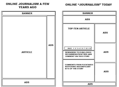
And design change is not limited to the print family. Web design is also rapidly changing. Take a looksy at this graphic:


On the left is a basic layout for a news website as few as fiver years ago. It includes minimal ads and a large block of space for articles.

On the right is a basic box model for a current newspaper site. Ads have roughly doubled, taking up a great chunk of sidebar space. But with all this advertising, what is left to design?

As journalism fades from online to print, what will happen to news design? Will it fade as well?

Your guess is as good as ours. Stayed tuned to newspapers everywhere over the next decade to find out.

Nov 15, 2010

Awards

The Pulitzer Prize is for writing and photography. I can't think of an award for copy editing. And the Pulitzer doesn't give out design awards. Despite its hardcore connection to journalism, neither does the Society of Professional Journalists Annual Awards. I'm not sure if SPJ thinks designers are real journalists.

Are designers real journalists? Yes. (But we all know that soon they won’t be. Soon all designers will be cyborgs created by Gannett to randomly fill space on the front page (on every page) of every paper. Every journalism competition that doesn’t have a category for designers is only making it easier for Gannett to go through with their robo-designers plan.)

For now, though, anyone who works at a newspaper (at, not for) is a real journalist (ad salesmen don't count — they work for a newspaper). Easier definition: anyone who considers a newsroom their second home is a real journalist, whether they currently work in one or not. It's a bit weird to think about designers as journalists, because when people decry the mass media, they are almost always talking about the reporters. Never the copy editors, never the designers. I'm not sure if citizens even know those jobs exist. Well, they do.

Back to my point. Awards. Newspaper design is important enough to warrant its own awards, though they aren't as high caliber as the Pulitzer or as well-known as the SPJ awards. Here's a list of some of the competitions, so you, too, can try to become Sports Designer of the Year.

Society of News Design
Sports Designer
Michigan State University

Nov 12, 2010

Press Plagiarism

Plagiarism is everywhere, and even journalists are not immune. (Remember Jason Blair?)

Copying someone else's words may seem obvious, but plagiarism also exists with news design, though it is harder to document and even more difficult to punish.

If a design looks similar to another, could it be pure coincidence? I'm sure it's possible for two people to produce similar pages without knowing or seeing one other's work.

And how else will designers get inspiration except for looking at other well-designed pages?

Where do you draw the line between inspiration and plagiarism?

Take a look at these two pages.

This one was printed in the Virginian-Pilot Feb. 24, 2006.


The Journal Review printed this front page April 3, 2006.


Both centerpiece stories were about a smoking ban with the same shape and even extremely similar type.  I find it hard to believe such similar results could be produced without copying.

While no legal action can be taken, closely copying another page makes a designer look lazy and unoriginal.

How can a designer stick to getting inspiration and avoid stealing? I heard a solid piece of advice once: It's OK to copy the idea but not the execution.

Enhanced by Zemanta

Nov 10, 2010

Web Design vs. Print Design

Differences
1. Print design doesn't include hyperlinks
2. Web design has essentially unlimited space to work with
3. Print design usually has a new layout every day
4. You can't spill coffee on your web edition (Well, you can, but it will only damage the machine, not the paper. And you can't just buy a new 50-cent newspaper, you have to buy a $1500 laptop. (That is, if you're using a laptop. iPhones are running anywhere from $700 to $1,000 (maybe more? I only checked Amazon).))
5. The web edition doesn't get nasty newsprint all over your fingers and face
6. You can't wrap your fish with the web edition
7. You can't wrap your holiday presents with the web edition
8. You can't punish your puppies with the web edition
9. You can't paper mache with the web edition
10. The web edition doesn't turn yellow with age

Similarities
1. They both are vying for readership

As you can see, there are a great number of differences between web and print design, and not a whole lot of similarities. I think one way to get more people reading more news online is to make the newspaper's website more similar to the newspaper. The New York Times is successful online partly because it's the New York Times, but partly because its website looks so much like the newspaper:


Each website needs to have this connection with its respective newspaper, because a lot of people in a community feel a connection to their newspaper. If the website looks nothing like the newspaper they love, then why would they check it?

Nov 9, 2010

Design Overhaul

We've all heard it, especially those of us in journalism school — print media is changing.

As newspaper companies fight to retain readers and advertisers and get out of the red, many of them are giving their approaches a makeover. After all, television has taught us in order to change our lives, we must first change our appearances. And newspapers are basically middle-aged women going through divorces to their previously loyal revenue models.

Bring on the newspaper redesign.

Redesign has many motivations, all are fairly obvious. Most big-name papers have been around for decades, and styles are always changing. Redesigns can help these older papers stay visually relevant to changing readers.

Also, big and bold is in. We've talked about newspaper trying to look more like magazines. Most aren't going that extreme yet, but a nice facelift will buy these papers time.

Most of all, newspapers are desperately trying to make money. Boring gray space no longer sells papers; beautiful graphics and eye-catching designs sell papers, especially to the younger, Web-oriented crowd.

Let's take a look at some of the industry's big redesigns:

This is The Bakersfield Californian in a side-by-side shot.


Notice how much more color the redesign has. The design is bolder, the centerpiece photo is larger and the area around the flag is more decorated. But does the design actually help convey the information better or is it all about the gimmick?

Here is another redesign — the Chicago Tribune's 2008 spiff up.

The new version features a left-aligned flag with a pretty teaser, wider columns and a bottom rail. The inside pages of the Trib received similar treatment with bigger, bolder page headers and more stand out headlines.


Notice one thing about both redesigns — you still recognize the paper. The flags are the same style, even if placement is different. A successful redesign can bring a new feel to a paper without losing the reputation the paper previously had. 

Readers of these two papers still know who and what they are reading. The presentation is just a little prettier.


Enhanced by Zemanta

Nov 8, 2010

Collaboration

As I stare across The BG News newsroom and listen to the solitary click of the keyboards, I realize that of all the jobs at a newspaper, being a designer is the most independent.

Except it's not.

When people think about reporters, peopled tend to think of them as outgoing, popular, talkative, nosy, incessant, annoying, hounding, persistent and evil. But we're not all like that. There are a variety of personalities working as a reporter for The BG News, and for every newspaper at which I've worked. So though designers might seem like lonely, quiet workers, while some are, some are anything but. Which is a good thing.

In addition of his or her boss, every good designer needs to know the name of the photographers, the copy editors and the reporters. It takes collaboration to make a centerpiece good — the reporter writes the story, the copy editor thinks of a headline, the photog gets art and the designer makes it look good. But it almost never looks good unless the designer talks to the reporter about what the story is about (or at least reads the story), talks to copy editors about possible headlines and talks to the photog about which photos are in publishable shape and how those photos could be used. Whew! That's not even close to a solitary job.

I can't remember the point of this blog post. I guess the point is that while designers are not out interviewing anonymous sources, they are just as much a part of the team as those who are in the public's eye. Also the point is that all of this will probably go away when newspapers die and stories and photos get published to the web without a second thought to what the headline should be.

Nov 7, 2010

Becoming a news designer: Part II - Web designer must learn new programs for print

Andy Baltes created a line drawing of the Beatles using their lyrics as typography.

Bowling Green State University Senior Andy Baltes wants to design for the Web, but for right now he’s going to have to settle for newspapers.
Baltes is in the Visual Communications Technology program at BGSU specializing in interactive multimedia. As part of the program, all students must satisfy two professional co-ops. Baltes decided to gain credit for one of his co-ops by working as a designer for the campus newspaper.
Most of the skills taught in his classes translate well, he said. He learns Adobe, Dreamweaver, Lightroom and Final Cut Pro, but not InDesign, which is what the newspaper’s designers use to lay out pages.
“It’s different mainly because of InDesign,” he said.
But there are other differences as well.
Baltes has to be aware of all the pieces and parts of a front page, and of every other page for which he’s responsible, like photos and headlines. He has to be able to change his design as the page evolves; sometimes stories or photos don’t fit, or there might be other last-minute changes.
“I try to figure out where [the front page centerpiece] is going first,” Baltes said.
And while Baltes said his classes do a good job teaching him how to use the different programs, students in other majors, such as graphic design, are actually taught how to design, but not how to use the programs.
“They learn the design,” he said. “[But] they don’t necessarily know how to quickly throw it together.”
Of all of the front pages Baltes has designed so far, his favorites include a centerpiece about flu shots and the Black Swamp Arts Festival.
For the flu centerpiece, he was able to be part of the creative process beyond designing the page, as he thought of the art head for the story.
“I had the most freedom doing that one,” he said.
For the centerpiece about the Black Swamp Arts Festival, Baltes said he experimented with the shape of the story a bit.
“Everything was slanted a little,” he said, “whereas most stories are box-shaped.”
Other schools in Ohio with VCT programs include Ohio University, Ohio State University and Kent State University.
According to its website, OU students in the Visual Communications program choose one of four specializations: photojournalism, informational graphics and page design, commercial photography or interactive design.
At KSU, students decide from nine different specializations within the Visual Communications field, according to its website, including Visual Communication Design (2D or 3D graphic design or illustration), Photojournalism and Information Design.
OSU students can only major in Visual Communication Design, and classes include Typography, Graphic Design Production, Design Methodology, Human and Environmental Design and Interactivity Design, according to its website.
The Missouri School of Journalism is one of a few schools that offer a master’s of journalism with a specialization in news design, according to its website. Students enrolled in this program and specialization take classes specifically about how to design for newspapers and magazines. Sample courses, according to the website, include Newspaper Editing, Magazine Editing, Magazine Design and Fundamentals of Photojournalism.

Nov 6, 2010

Becoming a news designer: Part I - Art student tackles news design

Kari Schneider glass blowing in the art building | By Jessica Vogt

Bowling Green State University senior Kari Schneider is an artist.

And every Thursday from 5:30 p.m. to midnight the graphic design major fills newspaper pages with her creativity.

In high school, Schneider tried her hand at several artistic mediums — ceramics, photography, drawing — before finding her niche in typography.

But when a design job opened up at The BG News, BGSU’s daily student newspaper, Schneider jumped at the opportunity.

“It was one of the only campus design jobs I’d heard of before,” she said. “I’ve always had an interest in newspapers, and I was interested to try and make news design more visually interesting.”

But her transition from graphic design to news design was not seamless.

Graphic designers create, choose and organize these elements—typography, images, and the so-called “white space” around them—to communicate a message, according to AIGA, the professional association for design. Graphic design is type and image-based, and requires a different approach and thought process than news design.

“News design is always about the story and following the style guide,” Schneider said. “There is more of a format that is expected. In graphic design, people are always trying to break the rules.”

Schneider’s newspaper spreads also require a different timeline than her art.

Typically, she has approximately three hours to develop and execute a spread. She reads the story, thinks about her approach and designs the centerpiece art, illustration or photo spread.

The rush has its perks, though.

“I like the community atmosphere and the rush for the deadline,” she said. “Sometimes you have to be more creative with what you can do in such a short time. With graphic design, you can overwork an idea and it looks too forced.”

Schneider is not the only graphic designer taking on newspapers.

Portugal’s i newspaper traded its traditional grid spreads for bolder, more beautiful designs featuring work by prominent graphic designers.

"I think the overriding concept, not just in the design but in the newspaper as a whole, is that we want to try to set out to produce a magazine every day," said Nick Mrozowski, i's American art director.

I’s pages, shown below, are custom designed each day, as the designers draw upon their artistic backgrounds.

Schneider finds this cross over between the two forms of design rare.

Many graphic designers who do embrace newspapers ends up crafting editorial cartoons or photo collages, she said. Even Schneider, after developing a deep appreciation and fondness for her newspaper work, prefers more nontraditional and strictly guided design.

And while Schneider’s required course work has prepared her for these visual tasks — a bachelor of fine arts requires 13 art studios and a portfolio review, according to the degree audit — the story-telling aspect of journalism is a new challenge.

“You always have to design not for yourself but for others,” she said. “One big thing about news design is that anyone could be reading it. Your design has to be accessible to anyone, even to people who don’t care about design breaking boundaries.”


Enhanced by Zemanta

Nov 3, 2010

Election fronts

It's the day after Election Day. Every good newspaperman in America is suffering from a hangover today, induced by a late night not of drinking Tequila but of drinking in the Republican sweep across the country. Both local and national elections happened, and here are some first rough drafts of history (the good, bad and mediocre) documenting the occasions.

The Arizona Republic

Weatherford Daily News 

Chicago Tribune

Latrobe Bulletin in Latrobe, Pa.

Post and Courier

Virginian-Pilot

Oshkosh Northwestern in Oshkosh, Wis.


Nov 2, 2010

It's the most wonderful time of the year

Ahh, Election Day. Every newsroom in America is filled with the excitement and anticipation of reporting poll results.

The BG News is no exception. Our coverage has been planned for weeks, and today the plan kicked into action. Reporters followed the results and photographers and videographers captured the action.

But what about the designers?

Election Night is synonymous with surprise. All the stories will all come in at once, probably pretty close to deadline. Designers are left with this challenging task of putting pages together with late-night information. No one knows exactly how the races will turn out, so a good designer is prepared for anything.

The concept for The BG News' election edition design was crafted in advance. The headshots for various candidates were pulled. The stories were assigned. And the page layouts were roughly sketched. Basically, the page existed in skeletal form, without any information, names or colors.

Designers also leave room for error — for that election result too close to call. They are ready to deal with any last-minute alterations.

And, at the end of the night, the design sells the page and proclaims the winners.

Here is a sneak-peek of the front page of Wednesday's BG News.


Enhanced by Zemanta

Oct 31, 2010

National College Media Convention

This past weekend, I attended the National College Media Convention in Louisville, Ky. with a few other BG News staffers.

The five-day convention consisted mainly of one-hour sessions dealing with every journalistic topic thinkable. I attended sessions on multimedia, editing, editorial planning, resume building, job hunting and, of course, news design.

One of the best news design presenters I listened to was Michael Koretzky from Florida Atlantic University. His sessions were titled "Chicken Salad" because you make chicken salad from chicken sh*t, and news design involves similar sifting.

Here are some highlights of his informative and colorful session:

  • Headlines should communicate an angle, not a topic; decks tell the story
  • Likewise, you cannot design a topic. You CAN design an angle.
  • Take lists of information out of stories. Pull them out and make them fact boxes.
  • Simple design works
  • A centerpiece needs to include people.
  • Pull elements out of the story to use as display text.
His last salutation encompassed the presentation:

Think big. Shoot defiantly. Write directly. Design boldly. 


Enhanced by Zemanta

Oct 29, 2010

When newspapers die...

...where will designers go?

Each newspaper has, we're going to estimate, anywhere from one to nine designers working each night. On average. There are a bit more than 1,000 daily newspapers in the United States.

Do the math with me.

1 X 1,000 = 1,000
9 X 1,000 = 9,000

Plus a few extra. So anywhere from 1,000 to 9,000 will be out of work. (But I will be the first to admit my shortcomings: my math is probably off. We'll just say millions.)

Imagine millions of good, bad and mediocre designers on the job hunt once the paper business folds. Where can they find work? Here are a few options.

1. Dairy Queen
I don't mean former news designers to soft-serve tasty treats to drunk college students at midnight. I want designers to redo the blizzard cup. I went to Dairy Queen a few days ago and I left unsettled with how the blizzard cups look. There is no consistency with the use of logos on the list of possible flavors. Some logos, such as Oreo, is in trademarked font, while some are not. And Oreo is only in trademarked font once. Consistency!

2. Marina and the Diamonds
Marina is a British music star. But she needs help with how to arrange the songs on her albums. Any competent individual would realize that "I Am Not A Robot" should have opened her album, "The Famly Jewels." We need some solid ideas to redesign this mess.

3. Book-cover Industry
I'm going to go ahead and plug my friend's blog about book covers. It might actually be kind of a good idea, though, for former page designers to get into designing book covers. Much the same thought goes into both jobs: both designs attempt to grab people's attention to read the content inside.

So have no fear! Designers, when your newspaper falls, you have plenty of options still to leave your mark on the world.

Oct 28, 2010

Design Abroad

So far this blog has highlighted one type of newspapers — U.S. papers.

In reality, European papers tend to be more notable and award-winning than the American counterparts.

European news design differs greatly, though. Language difference aside, it is easily tell spot an international edition.

For the most part, papers outside of the United States are still boasting larger page sizes and wider margins. Perhaps these publications are not hurting as badly financially as our are. Or perhaps their funding method is stronger. Either way, these publications have more room to work with, and it shows.

European publications also seem to be able to get away with more, from nudity to profanity. Violence seems to be more censored but not sex.

The pages are big and bold and full of strong content.

Here are some highlights of award-winning page design, according to Smashing Magazine:

De Morgen (The Morning) - A Flemish paper


Äripäev - an Estonian paper


Le Monde (The World) - A French paper


Oct 25, 2010

Selling above the fold

This front page is a fine-designed machine. Except for one thing. Can you spot it?


There is nothing exciting to compel readers to pick up the paper. Maybe the centerpiece is a clean design. Maybe. But the art head falls below the fold, so potential readers won't see it. Do you know what they will do instead? They will continue on to the laundromat, woefully uninformed of the political scandal currently wreaking havoc on Capitol Hill. What gossip will they be able to trade while not mixing their reds with their whites? None. And without a conversation opener, maybe they will never strike one up with the tall, handsome stranger with the dark eyes and chiseled jaw. And maybe then they will never marry and die alone surrounded by empty bottles of wine and cats. Or, even worse, maybe they'll pick up the competition.

So what do I mean by the fold? The fold is that crease in the middle of the newspaper when its folded in half to fit in the newsstand. Designers must always remember to keep the fold in mind when they're designing the front page. (For those who happen to be an inside page designer, the fold still matters, since it's still what readers read first, but it doesn't matter as much because by the time they get to that page, the paper is already open and the fold is almost irrelevant. Lucky SOBs.)

Of course, with the majority of the paper (and eventually all of it) transferring to the Web, this is mostly a moot point. And an excuse to show off the Greensboro News and Record's front page.

Oct 22, 2010

The price of news


What does this look like? 

...

If you answered, "Front page of the Los Angeles Times" or "Weirdly-designed news page," you would be wrong. Sorry.

It's actually an advertisement, parading as a front page. The entire front page of the Los Angeles Times is wrapped by this ad spread. But the new episode of "Law & Order" is not the main attraction of this page; notice the big "news" story. The headline is "Media icon hit by crime wave." 

There was no crime wave. The news was not news at all. It was just a sensational, pseudo story to attract attention to the advertisement (which was no doubt purchased with a lofty price). 

Only after picking up the paper and opening to page two could a reader see the real news of the day. And the only clue the artist of this cleverly-designed page gave to the spread's true intentions was a small note at the top of the page, above the headline: advertisement.

The Times has done this before, and they are not the only paper to have tried the ad-dressed-up-like-a-front scheme. But the writing and design of this particular September spread was intended to fool. The paper appears to be in dire need of a sale.

Is this an ethical move? Clearly page design has the power to fool. But should it? Will the paper lose future credibility?

The LA Times received mixed reviews. Readers were not happy with the slight of design. But the design did what the creative masterminds set out to do — sell papers. And this is a clear testament to the hard-up nature of newspapers.     


Enhanced by Zemanta

Oct 20, 2010

News magazine?

Just glancing at a news stand, you can easily see newspapers and magazine look different.

Magazine design is much more free. Grids aren't as rigidly adhered to. And designers can dream a little bigger with a magazine spread. Sometimes a whole page will be devoted to a headline and byline.

Look at this beautiful magazine spread. The point is clear; the art hed is catchy. But one entire page of the double-page spread consists of only the headline and the story's lede.


Lucky ducks.

Newspapers are shrinking, which means page space becomes even more precious. Designers would probably love to design a gorgeous page with white space galore, but rarely does the chance come up. (See an exception here.)

But with everything else in the industry changing, why shouldn't the way we think about newspaper design change as well?


This daily newspaper was launched in May 2009. Its creative directors decided to combine the best of magazine and newspaper design to produce bold, stunning graphics. This paper still tells its stories but in an arguably more visual way.

But is all this design leaving good reporting in the dust? Is a page's look now the most important aspect, rather than the accuracy and quality of the stories? Will other newspapers just on the bandwagon?

Oct 19, 2010

Flexibility


At The BG News, stories are turned in by 4 p.m., copy editors arrive at 5:30 p.m. and designers arrive at 6 p.m. Once designers arrive, they have until 10 p.m. to get their pages laid out. You might think this is plenty of time, but more than once I have had to pull the plug on a design idea at 8, 9, even 9:30 p.m. (That last one was a bad night. The designer had come up with a clever, optical illusion centerpiece involving a bowling pin. It wouldn’t have worked for two reasons. 1. It didn’t really have much to do with the story. 2. The optical illusion would have failed because both the fold and the gray newspages would have ruined the effect. I told her we couldn’t do that. She didn’t speak to me for the rest of the night. We’re still friends.)

Just like reporters always have to be aware of how their stories could change, designers have to be aware of when their idea just isn't working. Or when something else happens. Sometimes, breaking news happens and the centerpiece or lead news story could change entirely. Working at a newspaper demands a flexibility from everyone — flexibility of hours, schedules and whatever project they're working on. You have to know when your idea is going south so you can scrap it and throw together something at least mediocre to turn in by deadline. Because, you know what? The paper has to be published. No matter what.

Oct 18, 2010

Newspaper + Museum = Newseum

Let's talk about the Newseum.

Every night before they leave their shifts, front page designers of member newspapers submit that paper's front page to the Newseum. Then the front page is posted the next day in an exhibit called Today's Front Pages. Hundreds of newspapers from all over the world submit front pages, and they are available for easy viewing access. Also, the actual museum in Washington D.C. displays a couple hundred front pages of different newspapers every day.

Front pages from when Hurricane Katrina hit, from when Obama won the presidency and from Sept. 12, 2001 are archived and available to view online or in person at the museum. There are also exhibits depicting the history of news as well as the future of news. But for designers, the best part are the front pages.

Need inspiration? Check your favorite papers daily to see how they're showing their information to the public. Want to just marvel at good design? All the time, writers say you can't be a good writer until you're a good reader, well, this is reading for designers. You can't be a good designer until you see the good, bad and ugly ideas fleshed out on an actual newspaper. Want to feel good about yourself? The Newseum picks its top 10 front pages every day from the crop it gets each night. I know people who have designed one of those top 10. It's an ego boost for sure.

But whatever your reasons, check it out.

Oct 13, 2010

Design: From Start to Finish

Watch closely and witness the design process. Soon newspapers will just post everything to the Web, so it's important to document how it used to be done in the "good ol' days."

The BG News
Wednesday, Oct. 13, 2010
Production of Thursday's issue


Oct 10, 2010

Headlines for a Web Audience

In my crony's previous post, she wrote about catchy or punchy art heads (I spell it with the a), and how designers can blow them up big and play with typography in the absence of photos or a better idea.

Soon, though, art heads will be no more.


Since this blog is technically about all the things that will die when newspapers do, I figured I'd spend a moment to talk about Web headlines. Yes, they are different from newspaper headlines.

On a typical front page, for example, The BG News front page on Wednesday, Oct. 13, 2010, the centerpiece is graced with a punny art head: "University rakes in new students." A few, short words get the point across, and the story is further explained by the deck head below.

But this same story might have a revised headline for the Web, something like: "Bowling Green State University rakes in new students for Fall Preview Day." This is a fine headline, but there are now more words, making it less eye-catching and more cumbersome to say.

These headlines get changed for something called search-engine optimization. Newspapers want readers to find their websites, so they plug headlines with as many specific words as possible. When the headline just said "University," not many people would find that story through a search, because there are a lot of universities. But there is only one Bowling Green State University.

Gene Weingarten, a pulitzer-prize winning journalist at The Washington Post, wrote a column about this very phenomenon. His point was that newspaper headlines were losing their original magic when being revised for online readers.

But every once in a while, readers can still stumble across something like this.

Headlines aren't dead yet.

Oct 7, 2010

Gannett Revamp

Gannett Co., Inc., one of the largest publishers of newspapers in the country, will be taking its publications where no newspapers have gone before — streamlined design.
The newspaper power house, which owns 81 papers including USA Today, the Arizona Republic and the Indianapolis Star, will be moving in-house page designers to their own "studios" in five spread-out locations. These five design studios will layout pages for multiple papers daily.

The impact: design will be consolidated, many designers will be out of jobs and the process will go from designers working on a newspaper's team to being completely separate from the story process as the company attempts to save money.

The good news? Gannett promises all 81 papers will not look the same (although they will have many similar features). Riiiight.

As a former page designer and current newspaper editor, I have it on good authority that creativity can come in short supply at times. If I were expected to design pages for even 10 newspapers, I think I would start to repeat at some point. And begin working on autopilot. (Don't worry. I won't be applying for one of the jobs.)

Another kicker — many Gannett employees found out about the consolidation through rumors and a leaked blog post. Days later, they were officially contacted by the publisher. Oops.

So what does this mean for news design? Will all multi-paper publishers pick up this tactic? Will this method actually save the company enough dollars to make a difference? Or will this just produce cookie-cutter pages from burned-out designers with no connection to the reporters?
The switch is not set to begin for another year or so — the timing will not be the same for each hub. So the impact will not be immediately known. Guess we'll have to see.

Oct 6, 2010

It's all in your art hed

We often think of news design as the photos, layout or graphics on a page. But headlines are quintessential to successfully-conveyed stories — and designers just can't keep their hands off important page elements.

Designers don't always write the headlines (though some of the more talented visual journalists will). But their manipulation of text and use of typography, known as an art hed, can make or break the presentation of a story.

Take this page from today's Muncie Star Press in Muncie, Ind. The story is somewhat interesting — construction on the state's wind farm has been delayed. But the photo doesn't have any action; it is just a house. The real art of this stunning centerpiece is the title, "Taking the wind out of their sails."


A designer managed to make me look at a story I may have otherwise blown by. Honestly, the only reason I even looked at this paper was because the art hed got my attention.

But with power comes great responsibility. Art heds have the vast potential to go awry.

Here is a news infographic found on a News Page Designer portfolio. The stories discuss political platforms and agendas of several candidates. But the design does not tell you that. In fact, the art hed gives no clue as to what the stories entail. The poor art hed, combined with the graphic behind the text, produces a confusing page. The message has been muffled. Thus the design has failed its objective.


Oct 5, 2010

Let good content sell itself

If simple design is good enough for the man upstairs, then it should be good enough for everyone. God didn't add a bunch of factboxes or photos or graphics when designing the Ten Commandments — He let the content speak for itself. And it has, for thousands of years.


Stop putting so much pressure on yourself.

Good design doesn't have to be flashy or spectacularly clever. It just has to be clean and focused, with a clear path for readers' eyes through stories and photos.

If design gets too clogged with big, script headlines and a whirlwind of colors and shapes, readers could get distracted from the very story the newspaper is trying to sell. Which is the last thing anyone wants. It doesn't matter if flashy design gets someone to pick up a newspaper, if that same design is too convoluted and there's too much stuff for the reader to comprehend, they will quit reading, and the designer will be a failure.

One of the biggest, and hardest lessons for designers to learn is to let good content stand alone. A mantra of design is to design, and then take away everything that is not the design. Or, in less vague terms, take away everything that doesn't help to tell the story.

If the centerpiece photo is great, make it huge and leave it be. If all you have is a catchy headline, mess with the font, but don't add a bunch of nonsense. Words caught readers' attention one hundred years ago; I think they still have that power, no matter what j-schools are teaching these days.

Oct 3, 2010

A History of News Design, Part 2

A history of news design is, essentially, a history of news. For important, historic events, it has often been said that newspapers are the first rough draft of history.

Design is how that rough draft is presented to the world. Check out these newspapers and see how they present/preserve one historic event.

Sep 29, 2010

Thinking inside the grid


The best news designers can take a blank news page each day, with the same confining grid, and see something different. They can take the day's news or features and see a piece of art.

Stephanie Grace Lim is an acclaimed news designer, illustrator and photographer. The Society of News Design, the professional network which praises and critiques news design worldwide, has recognized her on many occasions. Her work is fun, whimsical and smart — the perfect combination for visual storytelling.

Lim used to design the San Jose Mercury News' entertainment tab covers, including the one pictured below.


This design is advertising alternative ways to spend a weekend in San Jose. The "detour," is not an obvious choice, but it fits perfectly.

The page is clean. With white space keeps a reader from being overwhelmed by text or graphics. And the toy cars and pop of orange color are eye-catching, to say the least.

This is just one example of the talent and tenacity news design requires.